Wellness Intention Forum
A community for those who need it most.
Executive Summary
As a personal project, I designed WIF as web app forum. It helps the many people who struggle with weight loss to connect with and build supports systems within the forum in order to help increase community and accountability.
The Problem
I used my experience and challenges helping people with weight loss as a starting point for my research. My initial hypothesis evolved as I began to understand my users and their varying needs. In the beginning, my assumptions were based on my experience with a variety of people I had helped over the years, along with my want to understand why so many people struggle.
Initial Problem Statement
People who are overweight do not have the knowledge around how their body works, their behaviors, and/or the better nutrition decisions to correct the issue.
Understanding The User
As someone who lost her mother to cancer, who had struggled with her weight for years prior to that, I am very invested in health.
My Role
U/X Research, UX/UI Design
Breaking Down The Process
RESEARCH
To understand my participants and how I could help, I needed to determine their level of mind body connection.
I needed to know:
How they live
What impacts them day to day
If the weight gain was triggered by something
Getting to know my research participants
The initial research was exciting and heartbreaking all at the same time. I found during my research that they all had a lot in common. This broke my heart. And on some level, I can understand exactly how they must feel. I had a ton of good cries during this phase of my project.
I was right about the triggering event, but it wasn’t what I thought it would be. I thought it was going to be the death of a loved one. It wasn’t! It was moving, which is a loss if you lose your community like my participants reported. There’s an aspect of grief here that sometimes is overlooked, but I want to bring it to life. We all grieve over losses. No matter what they are.
I have found that we don’t let ourselves grieve properly, and then loneliness and depression kicks in. Usually, we associated it with something else going on and try to mask it. With my participants, they associated food with comfort to help ease their pain.
Darko's Story
As a person dealing with weight gain and isolation, I want to have access to a community, where I can meet people just like me. People who struggle with weight, loneliness and lack of motivation. So we can all be accountability partners and a support system for each other, in our journey together.
Competitive Analysis
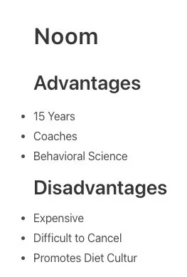
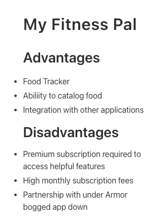
To understand the competitive landscape and how users interact with weight loss applications, I looked at two companies my research participants mentioned and one I knew that had the functionality that my participants made clear were important to them.
I identified a some common patterns my participants had in this arena as well.
-Weight loss apps are stressful
-Weight loss apps are too expensive
-Weight loss apps need more features
-Weight loss apps are too confusing
Pivot
As I was reviewing all the data I had gathered I made a huge discovery.
If the potential users pain points were
stressful
expensive
need more features
too confusing
Their pain points with applications for weight loss were
lack of community
loneliness
coping mechanisms
guilt
I had to make a major decision..
Do I try to recreate a Noom or Weight Watchers and hope to make it better?
I needed to revisit the original problem statement. At this point we already know at least one of my assumptions had been debunked by the research. I needed a new problem statement that aligned more with the evolving scope of my project. All the while keeping in mind the new problem statement. What can I do to create community, bring people together, and not have to charge them?
Problem Statement Revised
People who are overweight have had a significant life change, where they moved, lost their community, or were affected by Covid isolation. They struggle with loneliness, depression, and a loss of accountability, which all lead to lack of motivation.
Proposed Solution
Let's reference our persona first before we get to the possible solution - Darko used Reddit and Discord. Both of those are somewhat of a community.
I decided based on everything I had learned up to now, to build a forum specifically for people who are overweight and struggle with loneliness, eating disorders, lack of community and/support.
Design Evolution
Forum MVP
Onboarding
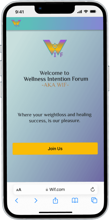
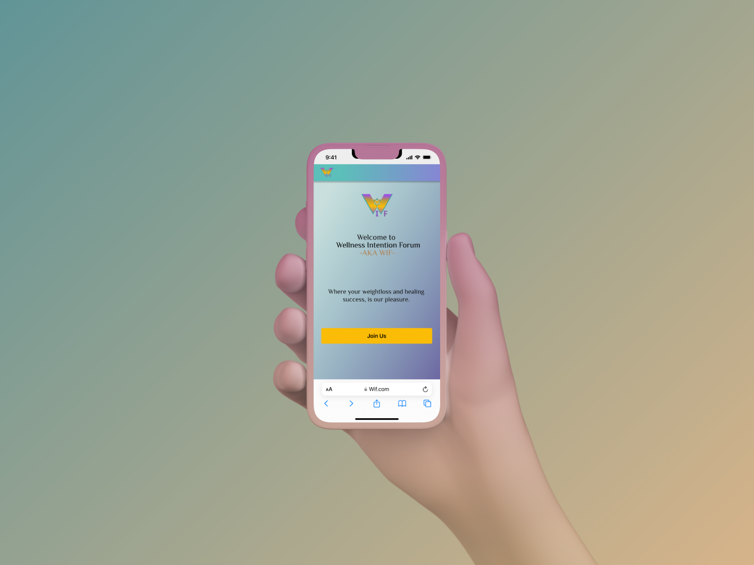
Splash screen with CTA/ sign up.
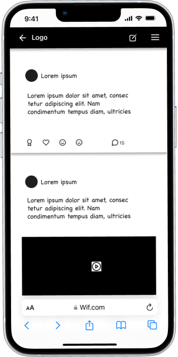
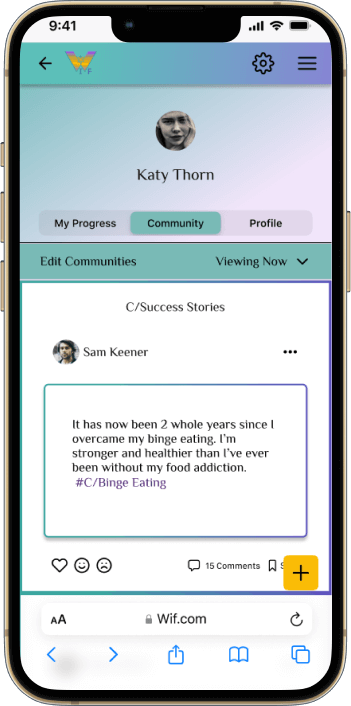
Home/Feed screen
To see community feed, create post, edit communities they see in feed.
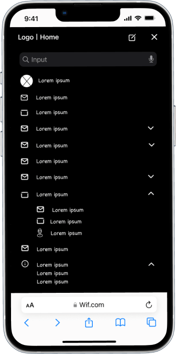
Hamburger
Footer nested inside to save "real estate".
Profile Screen
For all community, saved, chat, and comment features.
Activities Screen
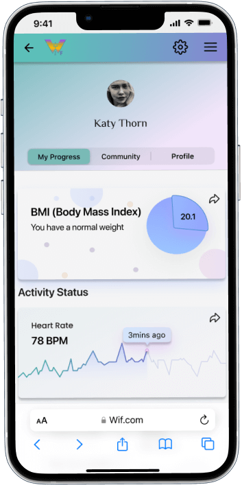
Integration with fitness applications potential users already have to see all their data in one place, with ability to share in the forums to discuss progress.
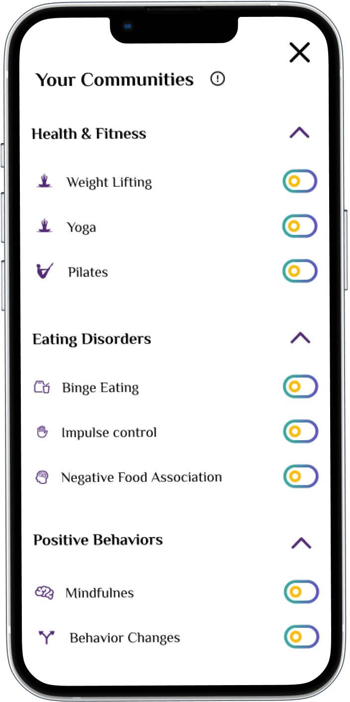
Community "Toggle" Screen
Ability to toggle on or off certain communities in order to have more control of their experience.
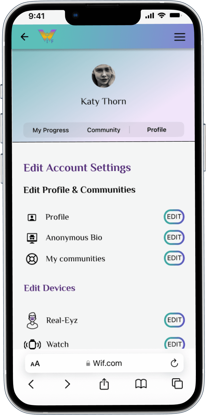
Settings Screen
Navigate to all account editing settings.
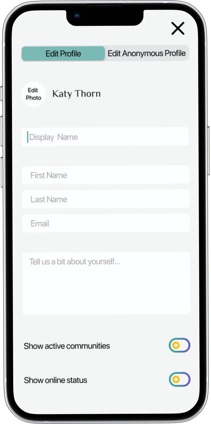
Edit Profile Screen
Ability to edit user profile, and anonymous profile.
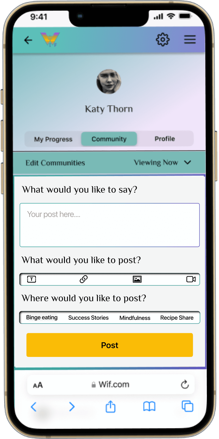
Posting Overlay
Ability to post, with multiple type of post options feature and cross post feature.
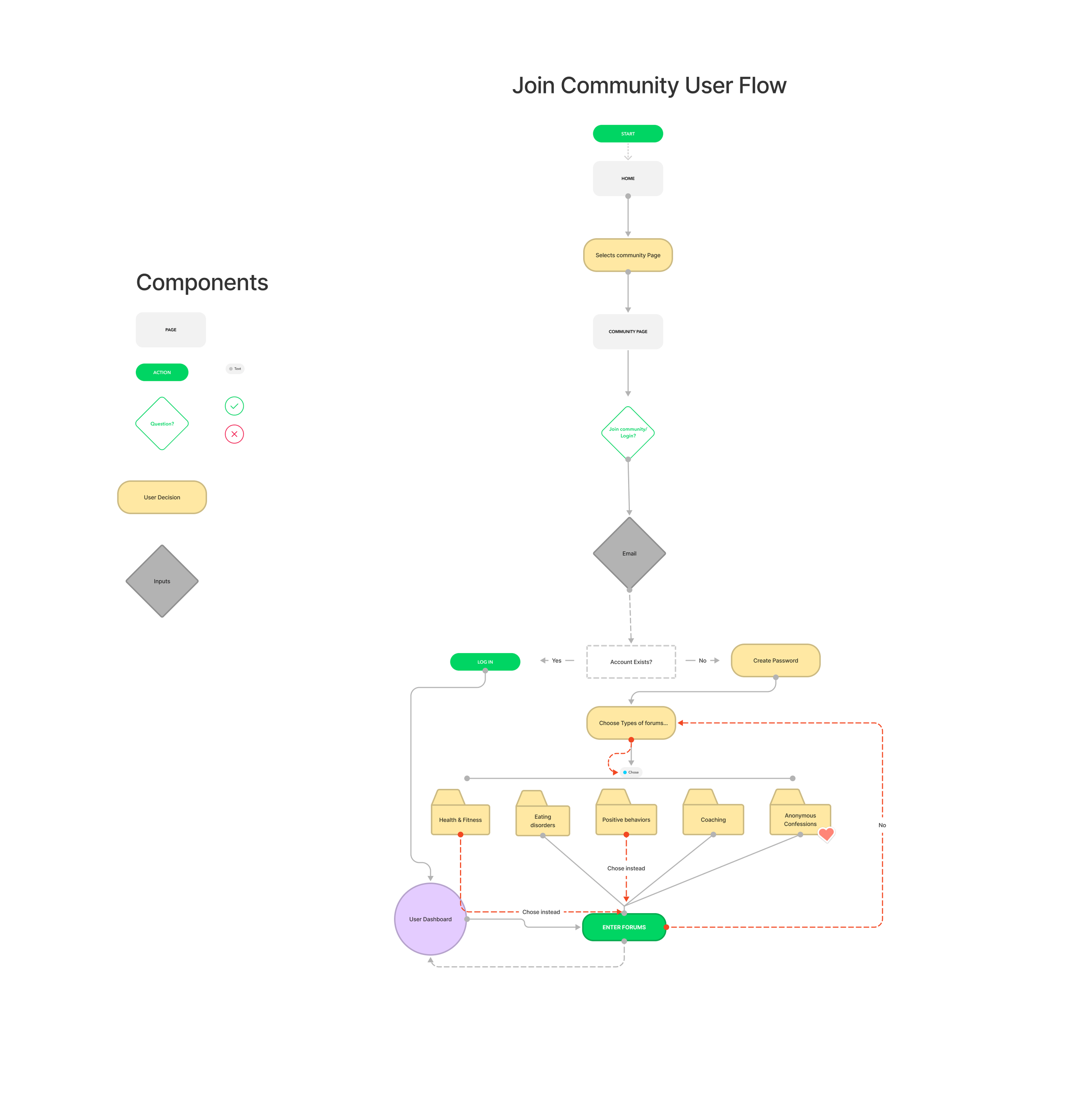
User Flow
Task Flow
Trying to put simplicity to work was the main goal here. These potential users are working so hard to reconnect and reach their goals, so why not make it as easy as possible for them to do that.
The community folders you see here in this illustration are the toggles you will see in the community screens later on.
I wanted them to have the maximum control of the content in their feed. By allowing them to choose right away they could check out forums that spark the most interest. I also wanted to give them and an easy way to turn the forum on or off. This helps focus, clarity, and the overall look of their feed. Users will evolve in their needs over time and I wanted to give them the freedom and capability to do so
Wireframes to Mockups
Splash Screen
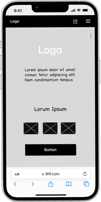
Lo-Fi:
Splash screen with large call to action
Mockup:
I made a few simple changes to the design to keep it simple with plenty of white space, and a clear route to the CTA
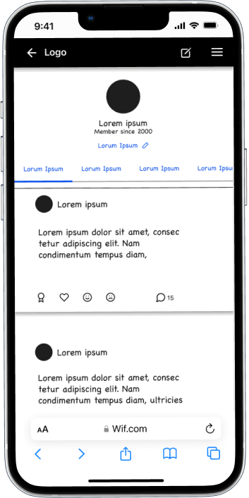
Feed Screen
Lo-Fi:
User home/feed
Mockup:
Added a better navigation function with the segment changer element
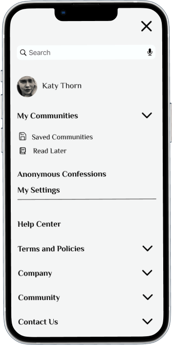
Hamburger Screen
Lo-Fi:
Originally I had planned for this to be main navigation. So I placed everything I could think of that could possibly go into this screen, in order to come back and delegate and clean up during iteration
Mockup:
Cleaned this up significantly when I chose to use the segment picker navigation route
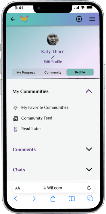
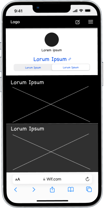
Profile Screen
Lo-Fi:
Originally I designed this screen for users personal posts to live in, as I was using established forums like reddit, and instagram for inspiration
Mockup:
During iteration I decided to clean it up and give the user another level of control, to be able to chose if they want to see those things by adjusting it to a menu. this was also to cut down on clutter and not confuse the user
Activity Screen
Lo-Fi:
This screen was a free for all at fist, I hadn't established what content would be most appropriate for the functionality
Mockup:
As all of the screens evolved, the activity screen seemed to just take form itself. Being that it is for discussion, I looked back into my research participants and what seemed important for them, also looking at what other applications they would be using, the data that could be possible and added them respectfully
Interactive prototypes
Prototype 1:
Interactive toggle screen for user content management
Prototype 2:
Edit all account settings, and device integration
Interactive prototypes
Prototype 3:
Profile customization
Prototype 4:
Crosspost capability
Usability Testing
Objectives
Determine if user/task flow is easy
Determine accessibility
Determine if navigation is easy
*Each usability testing participant was given 5 tasks to determine if all of the objectives listed above could be validated.
Usability Testing Feedback Analysis
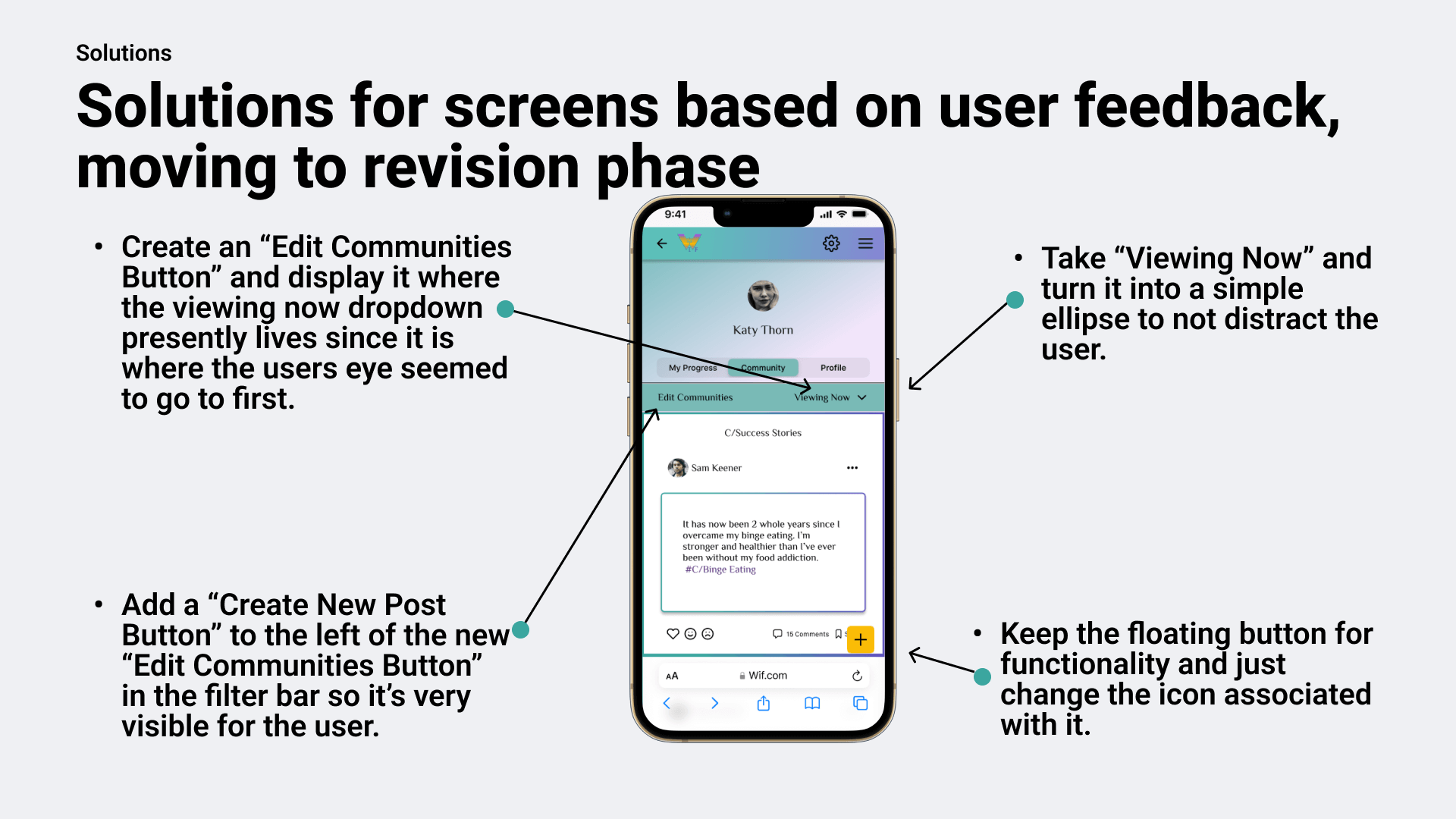
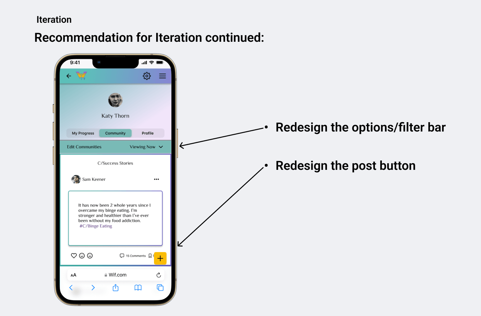
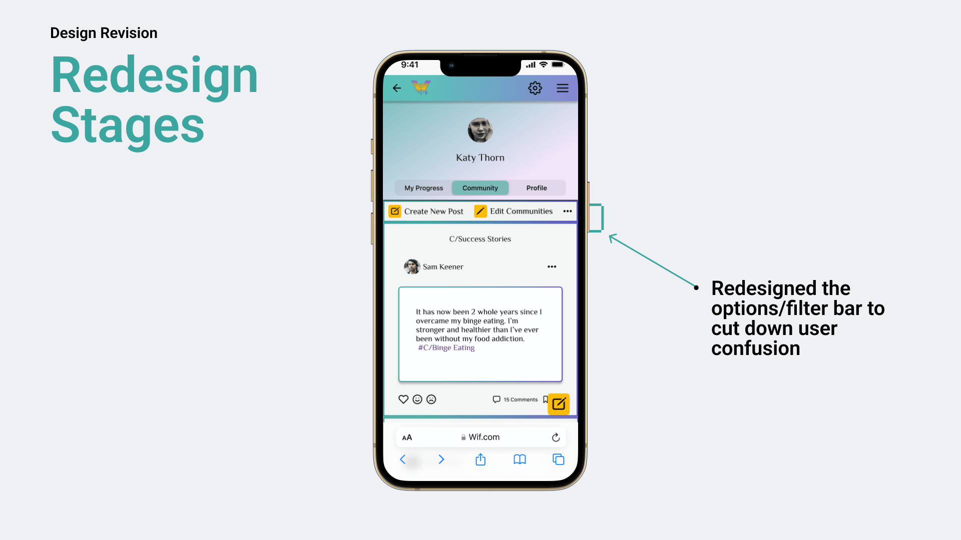
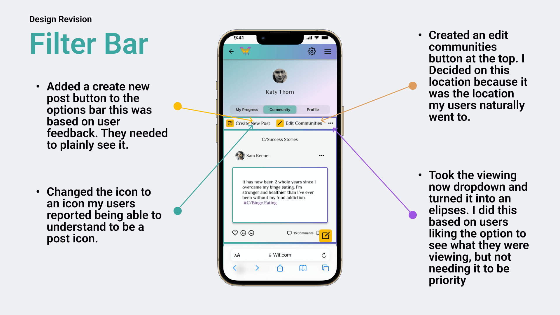
Couldn’t find edit communities section in filter bar
Seemed to get stuck on the viewing now dropdown when tasked to edit communities.
Were attracted to the viewing now dropdown
Thats Great! Except when that's not the place you were hoping they would chose when tasked with something other than finding the viewing now dropdown.
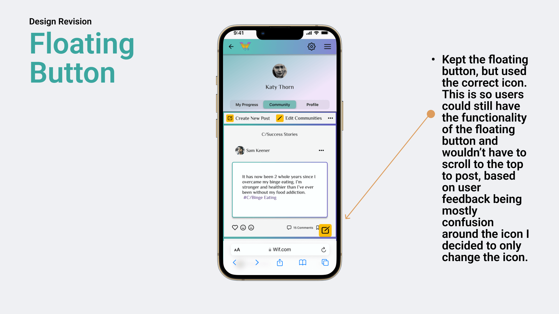
Confused by the plus icon in the floating button for posting
When tasked to create a post, were reluctant to choose the floating button. Once given help they reported they thought it was what they were supposed to do, but were thrown off by the plus icon on the floating button.
Reported to really enjoy the experience despite the few small fumbles.
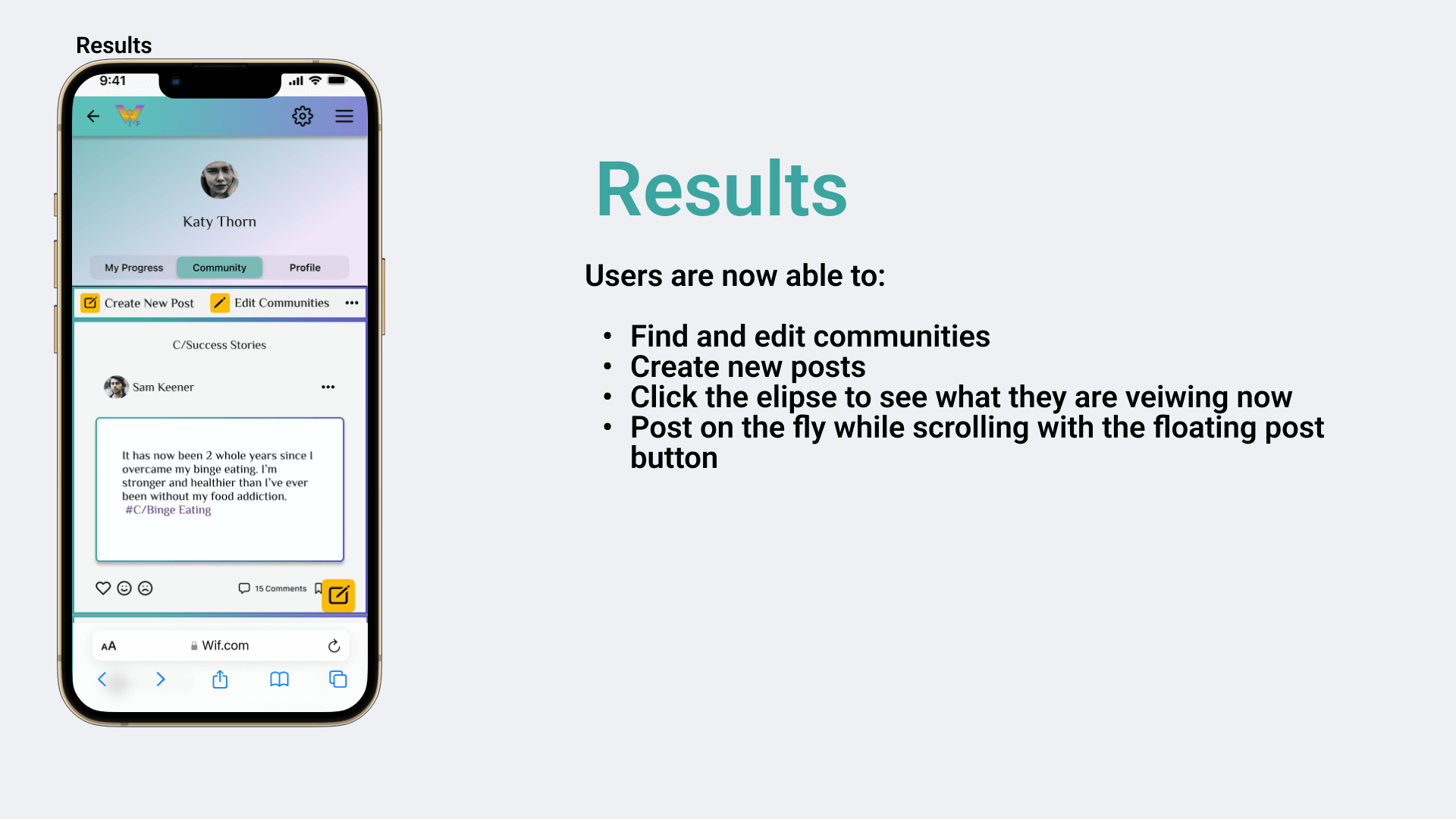
I was pleased by the feedback I got overall. The participants liked the look and simplicity of the web app. They validated many functions and gave me great feedback on the objectives that didn't make it to validation.
Iteration Based on Testing
Lessons Learned
-Test throughout - For me testing helps me work out kinks I may have not seen
-Framing research questions correctly will be the gold in your sifting pan- This is a skill I really want to hone
Pivoting is definitely a real thing- This project turned out nothing like I assumed in the beginning. I
-Agile design is the only way to go- I want to know consistently if I’m on the right path. As a Certified Scrum Master and Certified Agile Practitioner I truly believe in this process.
Next steps
-Back to user research to see if I can uncover more information and dig into why the"Anonymous Confessions" idea sparked
curiosity in so many people along the project journey.
-Revisit and design the "Anonymous Confessions" functionality.


